

Leonora Polonsky
From Strategy to Site: LPA’s Webflow Relaunch in 3 Weeks

Exposition
Leonora Polonsky & Associates has always operated in rooms where vague thinking doesn’t survive. Founded and led by seasoned brand strategist Leonora Polonsky, the firm helps organizations build modern brand strategies that are not only rigorous—but actionable. Their work doesn’t end at the “big idea.” It continues through activation: reframing value, sharpening positioning, discovering disruptive insights, accelerating execution, and training internal teams so strategy becomes muscle memory inside the organization.
Their clients span Fortune 500 brands and fast-scaling companies across industries like CPG, technology, healthcare, consumer goods, and services. This is work built for senior decision-makers—leaders who need clarity they can defend, language that carries weight, and direction that unlocks measurable outcomes. LPA’s edge comes from both depth and discipline: decades of experience across 30+ industries, paired with a pragmatic, no-waste approach that favors precision over performance.
But while the firm’s thinking had sharpened and their visual direction had been refreshed, their website was still living in an older chapter. It was professional. It was informative. It was credible. And yet, it didn’t fully feel like the firm—at least not the firm as they had become. The digital experience wasn’t guiding visitors with the same crisp structure LPA brings to strategy work. The platform itself felt more constrained than flexible. The narrative was there, but it wasn’t landing with the immediacy and confidence their audience expects.
In a world where first impressions are often digital, that subtle misalignment matters. Especially when your clients are discerning, senior, and short on time.

compelling event
The trigger wasn’t a desire to “freshen things up.” LPA already had a new visual direction and a clearer articulation of their methodology. What they needed was for their digital presence to catch up—to translate that evolution into an experience that felt as intentional as their work.
And then the timeline arrived.
They needed the new site live in three weeks.
Three weeks changes everything. It compresses decisions. It exposes weak processes. It leaves no room for ambiguity, slow back-and-forth, or technical friction. The designs had to be translated faithfully into Webflow. The information architecture needed to be sharper—built for the way strategic buyers think. Conversion paths had to be clearer and more natural. And the entire system had to be future-ready, not fragile.
They weren’t looking for someone to experiment.
They were looking for someone to execute—with control, speed, and craft.
That’s when they brought in us at Fri3nds. Not just to build a website, but to deliver a launch-ready platform under pressure—without losing the precision their brand is known for.

the process
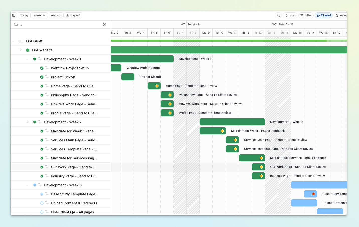
With only three weeks on the clock, our process had to be intentional from the first hour. The designs were already approved, so our first move wasn’t discovery—it was alignment. We ran a tight session to eliminate ambiguity early: confirming what mattered most for the first release, defining the CMS needs, mapping redirect considerations, clarifying SEO essentials, and establishing approval checkpoints that would keep the sprint moving.
That early clarity became our leverage. In fast projects, speed isn’t the result of working harder—it’s the result of removing friction before it appears.
From there, we ran development in rolling waves. We didn’t disappear for two weeks and come back with a “big reveal.” Instead, as soon as a batch of pages was ready, we shared it. That created momentum and surfaced feedback while we still had time to respond thoughtfully. While we built new sections, we simultaneously refined previously delivered pages. The rhythm stayed consistent: build → share → refine → advance. It kept the sprint clean, reduced risk, and prevented bottlenecks from piling up in week three.
Midway through, the project had the kind of wobble every accelerated timeline eventually produces. We were collecting feedback through Pastel—smooth, structured, efficient—when the platform suddenly stopped allowing the client to add comments. There was no time to wait for tools to behave, so LPA pivoted immediately and consolidated feedback in a shared document. Shortly after, Pastel resumed, leaving us with two parallel sources of truth.
In a three-week sprint, duplication is dangerous. It creates gaps. It creates missed details. So we did the unglamorous but responsible thing: we manually cross-checked both sources, comment by comment, page by page. It meant extra effort on our side—but it protected the integrity of the project. Nothing slipped. Nothing got “lost in the shuffle.” Under pressure, that kind of discipline is what keeps a build from unraveling.
By the time week three arrived, we weren’t scrambling—we were refining. Because feedback had been handled continuously, the final stretch became about precision: responsive QA across devices, performance checks, SEO structure, redirect logic, CMS population, and the polish that makes the experience feel sharp, not rushed.

the outcome
In three weeks, LPA didn’t just get a new website. They got a rebuilt digital system—one that felt aligned with their authority and designed to scale beyond launch day.
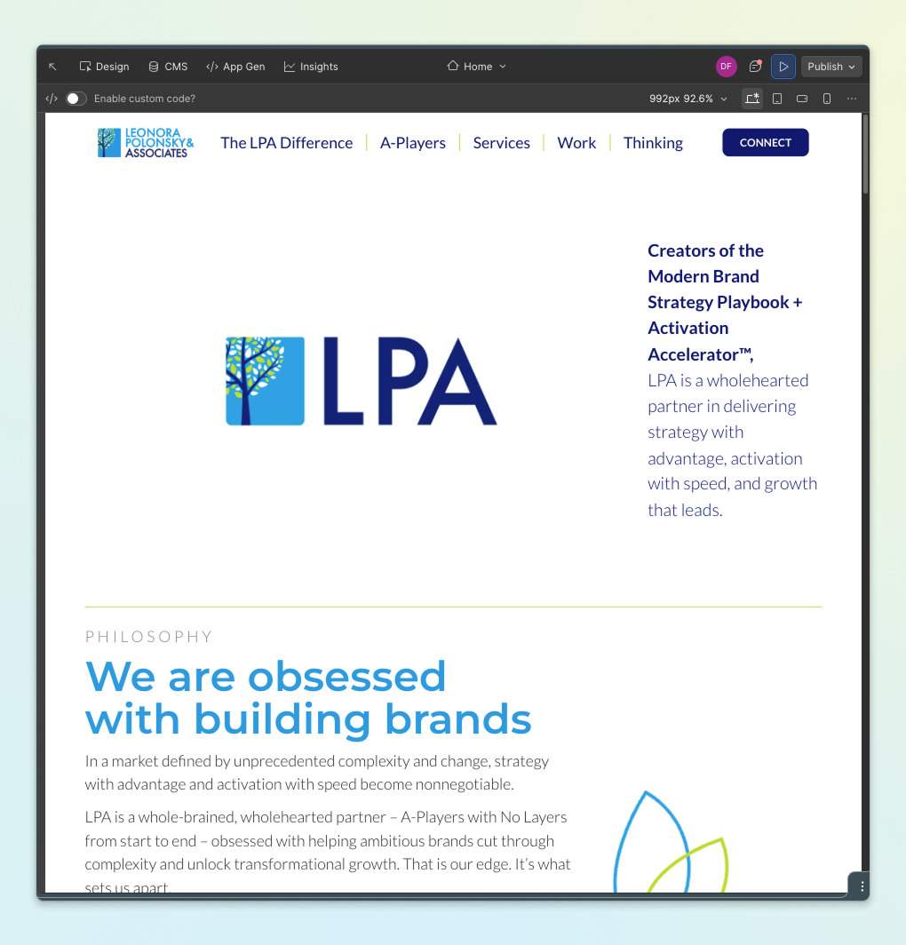
We developed the full website in Webflow from the approved designs, translating the refreshed visual direction with pixel-level accuracy. Typography, spacing, layout rhythm—everything was implemented with care so the site felt intentional, not merely assembled. The experience is modern without being loud. It doesn’t chase attention. It communicates confidence through structure and restraint.
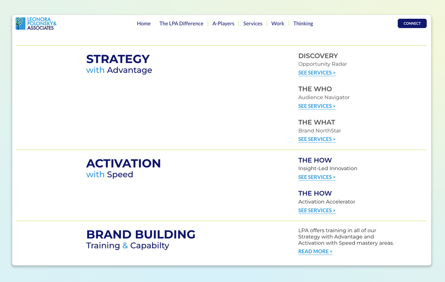
We refined the information architecture so senior decision-makers could immediately understand what LPA does and how their offerings connect. Services, training, insights, and methodology were organized to reduce cognitive load and guide the visitor through a clearer story. Navigation became strategic—not just a list of links, but a path that mirrors how strategic buyers evaluate partners.
Conversion logic was treated as part of the build. We improved CTA placement, clarified entry and exit points across key pages, and reduced friction in inquiry flows so exploration naturally leads to conversation. Behind the scenes, we built a structured CMS foundation designed for autonomy: dynamic templates for thought leadership, consistent layout rules, and a system the team can confidently update without relying on developers for every change.
We also implemented details that quietly elevate the experience. We integrated the newsletter directly with Constant Contact and fully customized its styling—typography, spacing, button treatments, input states—so it felt native to the brand, not bolted on. We layered in subtle motion and micro-interactions—entrance animations, scroll-triggered transitions, refined button behavior—to create rhythm and reinforce hierarchy without distracting from content. The site moves with purpose, not flash.
The result: a platform that looks sharp on the surface—and is technically clean underneath it.
the impact
When the new site went live, the change wasn’t loud.
It was decisive.
The most immediate shift was alignment. LPA’s digital presence now matches the rigor, clarity, and strategic sophistication they deliver to clients. When they share the site with enterprise stakeholders, there’s no longer a quiet disconnect between their authority and their online expression. The site supports sales conversations now—it frames them.
The refined structure and sharper messaging also changed how prospects arrive. Visitors reach out with clearer context. They understand what LPA does, how the firm approaches strategy, and what makes their methodology distinct—before the first call. That pre-clarity matters. It shortens the distance between curiosity and conviction, and it improves the quality of early-stage conversations.
Operationally, the migration to Webflow created leverage. The LPA team can now update content internally, publish insights independently, and evolve messaging without technical bottlenecks. That autonomy compounds over time: faster iteration, more consistent thought leadership, and a platform that can keep pace with the firm’s growth.
Before, the site explained who they were.
Now, it reinforces who they are—every time someone visits, shares, or references it.
And for a firm built on strategic clarity, that reinforcement is not cosmetic. It’s a competitive advantage.


.svg)
.svg)


.svg)
.svg)
transform your business with us
We specialize in creating innovative brand strategies and stunning website designs.


